
Blog
Best Travel Brochure Templates for Agencies & Tour Brands
Travel Brochure Templates – Ultimate Guide for Agencies & Designers
Introduction
We craft travel brochures that sell trips. In this guide we combine practical design methods, copy tips, distribution tactics, and template strategies tailored for travel agencies, event marketers, and designers. Whether you prefer printed leaflets or interactive digital brochures, this article delivers actionable advice and ready-to-use travel brochure templates strategies to increase bookings and audience engagement. Ready to start designing brochures that turn browsers into bookers?
How to design travel brochures
Design with purpose. When we design travel brochures, we begin by asking very simple but powerful questions: who is the reader, what action do we want, and what makes this trip unforgettable? Good brochure design is less about decoration and more about converting curiosity into booking. To achieve this we follow a focused three-step approach: research, concept, and craft.
Research. Start with audience profiling. Are we targeting families seeking beach holidays, solo adventure travelers, or corporate groups? Each target needs different imagery, copy tone, and offers. We mine search intent and user questions – for instance, “what’s included” and “how safe is it” are common for international travel. That becomes the scaffolding for the brochure’s sections.
Concept. Choose one main emotional hook – relaxation, adventure, culture, or luxury – and make it the visual and textual spine of the brochure. Use that hook to determine color palette, image style, and headline voice. For example, an adventure hook favors bold, high-contrast photography and active verbs; a luxury hook favors spacious layouts, muted palettes, and refined typography.
Craft. Keep the layout modular. Use a strong, attention-grabbing cover image with a short, compelling headline. Inside, lead with benefits, not features: instead of “7-day tour,” write “Seven days of effortless island-hopping and private beach escapes.” Use clear calls-to-action (CTA) near pricing and booking details. In print, include scannable QR codes; in digital, embed interactive maps or clickable call buttons.
Practical tips:
- Keep paragraphs short and scannable.
- Use bold subheads for each section (it helps both readers and SEO).
- Prioritize white space – it improves perceived value.
- Always include a clear, prominent CTA and contact details.
We treat every brochure as a mini-website: structured, persuasive, and optimized for action.

Order Now
Key elements of a travel brochure
A high-converting travel brochure includes specific components arranged logically. We always verify that these elements appear in every template: clear branding, a magnetic headline, benefit-driven intro, high-quality imagery, itineraries, pricing, inclusions & exclusions, social proof, terms, contact info, and a single, compelling CTA.
Branding & headline. The cover should instantly communicate the experience and the brand. A headline is not a description – it is a promise. For example: “Sunset Safaris: Sleep Under the African Sky” is stronger than “Kenya Safari Package.”
Hero image & visual hierarchy. Use a large hero image that reflects the headline’s promise. Create a visual path: hero → highlight features → testimonials → package details → CTA. Use typographic scale to guide the reader’s eye.
Essential travel details. Include clear itinerary bullets, duration, price ranges, inclusions (meals, transfers), exclusions (visa fees), and booking deadlines. Use icons for quick scanning – calendar for dates, plane for flights, bed for accommodation.
Social proof. Short customer testimonials, review scores, or award badges increase trust. We recommend using a two-sentence testimonial and a photo when possible.
Legal & logistical. Add cancellation policies, health requirements, and insurance advisories neatly at the footer or a dedicated side panel. This maintains transparency and reduces post-booking issues.
Tracking & response. For printed brochures include a unique promo code or QR code to measure responses; for digital brochures track clicks and time on page.
By making these elements deliberate and modular in the travel brochure templates, we ensure each brochure reads like a clear, persuasive sales piece.
Travel brochure templates: choosing the right layout
Templates accelerate production and ensure consistency across campaigns. We categorize template layouts into three broad families: brochure-as-story (long-form), quick-sell flyer (one-pager), and folded brochure (multi-panel journeys). Choose a template that matches your product complexity.
Brochure-as-story. Ideal for multi-day itineraries and luxury packages. Use large visuals, long-form copy, and immersive design elements. This template allows storytelling – we recommend hero images, anecdotal testimonials, and immersive itineraries.
Quick-sell flyer. For promotions, last-minute deals, or event handouts. A single page with 3–4 punchy sections: offer, feature bullets, price, and CTA. Keep typography bold and direct.
Folded brochures. Bi-fold and tri-fold templates are classic for travel agencies. Use panels deliberately: front cover (hook), inner panels (itinerary & features), back panel (contact & CTA). Ensure panel order is logical when folded.
Template best practices.
- Maintain a grid system for consistent alignment.
- Use modular blocks to swap offers without redesigning.
- Include content placeholders: headline, subhead, deck text, bullet list, image frame, testimonial, CTA.
- Provide print bleed and safe margins in templates.
We also design adaptive templates: the same content works across print and digital by swapping imagery size and enabling interactive elements (maps, videos) in the digital version. A good template reduces turnaround time while improving brand coherence.
Effective brochure layout ideas
Successful layouts guide readers from emotion to action. We recommend layouts built on a simple funnel: engage → inform → reassure → convert. Start with a full-bleed cover that sets the mood, follow with a benefits grid, display one clear itinerary (or options), then finish with testimonials and a CTA.
Grids and modules. Use a 12-column grid for flexibility. For tri-folds, plan three vertical modules per side. In digital single-page brochures, stack modules vertically with bold section dividers. Modules might include: Why Choose Us, Day-by-Day, Pricing & Add-ons, FAQs, Reviews, and Contact.
Visual rhythm. Alternate full-bleed images with white space sections. This alternation creates a rhythm that keeps attention. Use pull quotes and feature boxes for value statements.
Information density. Keep one major idea per panel or block. Too much micro-detail overwhelms; provide essential facts and link to long-form content or QR codes for full terms.
Calls-to-action placement. Place CTAs at least three times: cover (teaser CTA), middle (after benefits), and end (final booking CTA). CTAs should use action verbs and urgency when appropriate – “Book Your Spring Escape – Limited Seats.”
Accessibility. Use legible fonts at readable sizes (body copy ≥ 10-11pt for print, 16px+ for web). Maintain contrast ratios and avoid tiny captions.
Example layout idea: Left panel: Hero + Headline; Middle panels: Itinerary + Visual highlights; Right panel: Pricing + CTA + Contact. This flow takes the reader from aspiration to action in a single fold.
Travel brochure design software: tools we recommend
We prefer tools that balance robust layout control with ease of use. Here are the options depending on skill and scale:
Professional design tools:
- Adobe InDesign – industry standard for multi-page print and complex layouts. Best for agencies producing high volumes and custom templates.
- Affinity Publisher – cost-effective alternative with similar layout power and one-time purchase. Good for agencies needing professional control.
Fast, templated tools:
- Canva – versatile for quick templates, social-ready assets, and collaborative teams. Great for non-designers.
- Visme – strong for interactive digital brochures and data-visualization blocks.
Interactive & digital brochure platforms:
- Flipsnack and Issuu – convert PDFs into flipbooks with embedded links and analytics. Good for digital brochure distribution.
- Adobe Express – templates and quick resizing for multi-platform needs.
Image & asset tools:
- Adobe Photoshop/Lightroom – for image retouching and color correction.
- Unsplash / Pexels / Depositphotos – for licensed photography (always confirm commercial usage rights).
Workflow & collaboration:
- Figma – for collaborative template design and component libraries; allows handoff to developers for digital interactive brochures.
- Dropbox / Google Drive – asset version control and proofs.
We choose tools based on the campaign timeline, team skill, and whether the final brochure is printed or digital. For consistent travel brochure templates, maintain a shared asset library with approved images, fonts, and color swatches.
Travel brochure color schemes that convert
Color sets mood and signals brand personality. We select palettes that match the travel experience: turquoise and coral for tropical escapes, deep greens and sandy neutrals for eco-tours, and muted golds and charcoal for luxury travel. But color isn’t just aesthetic – it improves conversion when used to guide attention.
Color psychology in travel brochures. Blue inspires trust and serenity – ideal for cruises or coastal vacations. Green suggests nature and sustainability – perfect for eco-tourism. Warm hues (reds, oranges) evoke excitement and can boost urgency in calls-to-action. Use no more than three primary colors plus neutrals.
Contrast and CTA. The CTA color must contrast with surrounding elements. If your palette is predominantly cool, use a warm accent for CTAs. For example, a soft blue layout with a bright coral CTA works well. Maintain accessible contrast ratios for text legibility.
Accent usage. Reserve stronger colors for highlights, badges, and CTA buttons. Secondary colors can appear in icons and dividers. Background gradients can create depth but avoid noisy textures over text.
Consistent branding. Create a color swatch guide in your template: primary, secondary, accent, background, and neutral. Apply color to map overlays, price tags, and callouts consistently.
Seasonal variations. Adjust palettes for seasonal campaigns: richer tones for fall escapes, pastels for spring promotions. This keeps templates fresh without a complete redesign.
A thoughtful color strategy makes brochures visually coherent and steers readers toward desired actions.
Travel brochure typography tips
Typography is your silent salesperson. We choose fonts for clarity, personality, and hierarchy. Use a maximum of two type families: one serif or humanist sans for headings, and a clean sans for body text. Avoid novelty display fonts that reduce legibility.
Hierarchy. Use size, weight, and color to create clear hierarchy: headline (34–48pt or large web H1), subhead (18–24pt), body (10–12pt print; 16px+ web), and captions (8–9pt print). Bold key benefits and keep line length between 45–75 characters for readability.
Readability. For printed brochures choose fonts with clear letterforms (e.g., Lora, Merriweather, Source Sans Pro, Montserrat). For digital brochures ensure web-safe equivalents and proper line-height (1.4–1.6) to improve scanning.
Tone via typography. Serif fonts communicate tradition and luxury; humanist sans fonts convey friendliness and approachability. Adjust letter spacing for display headings but tighten for body copy.
Icons & numerals. Use tabular figures for price lists to keep alignment neat. Use simple icons with consistent stroke weights that pair well with font stroke.
Accessibility. Avoid all-caps for long passages – they’re harder to read. Use 1.15–1.5 line-height in print and larger for mobile screens.
By treating typography as a tool for clarity and persuasion, brochures become easier to scan and more convincing.
How to use images in travel brochures
Images sell experiences more than words. We use images to convey mood, scale, and authenticity. Pick photos that show people (emotion), place (context), and activity (what travelers will do).
Hero imagery. Use a single striking hero image on the cover that exemplifies the trip’s main promise. Avoid generic stock imagery; prioritize images with real moments and natural composition.
Sequence and storytelling. Arrange images so they tell a short visual story: arrival → experience → relaxation → celebration. This mirrors the reader’s mental journey and encourages imagination.
Photo quality & editing. Use high-resolution photos (300 DPI for print). Color-correct images for consistency across the brochure. Crop photos to focus on the subject; use overlays or gradient fades to ensure text legibility.
Diversity & representation. Show diverse travelers and inclusive experiences. For international brochures highlight cultural authenticity and respectful imagery.
Icons & maps. Complement photos with simple map snapshots and icons to clarify logistics. Use image captions with practical info (e.g., “Sunset at Petra – guided evening tour included”).
Legal concerns. Always confirm usage rights for images. Prefer signed model releases for photos featuring people.
Effective imagery paints a promise and makes the destination tangible; treat it as a primary conversion asset.

Order Now
Travel brochure content writing tips
Compelling copy is brief, benefit-led, and vivid. We write as if describing the experience to a friend who’s short on time. Use sensory adjectives, specific details, and active verbs.
Lead with benefits. Instead of “Includes hotel,” write “Wake to ocean views from a private balcony.” Benefits answer the reader’s implicit question: “What’s in it for me?”
Use the inverted pyramid. Put the most important info at the top: headline, price, dates, CTA. Then deepen details for readers who want more.
Powerful CTAs. Use verbs with urgency or exclusivity: “Reserve Your Spot,” “Book Early – Save 15%.” Always provide multiple contact options.
Headlines & microcopy. Headlines should be short and evocative. Microcopy (captions, buttons) should reduce friction: “Free cancellation within 7 days” or “Visa assistance included.”
Storytelling & analogy. Use short anecdotes or metaphors to make the trip feel unique: “Like waking inside a travel magazine – but this is real.” A single well-placed analogy can transform a feature into an experience.
SEO & keywords. For digital brochures use natural phrases – including the target phrase keywords for the topic of my travel brochure templates – in headings and alt text. Avoid keyword stuffing; prioritize readability.
Proof & clarity. Avoid vague superlatives (“best,” “luxurious”) unless supported by specifics (awards, ratings). Keep sentences short and avoid jargon.
Good copy creates desire and clarifies action. We craft every line to move the reader one step closer to booking.
Creating interactive travel brochures (digital)
Digital brochures unlock interactivity: embedded maps, video, booking links, and animations. We design digital versions to be bite-sized, mobile-friendly, and trackable.
Formats & platforms. Use responsive PDF with clickable links for email attachments, flipbooks (Flipsnack) for shareable experiences, or single-page microsites for deeper engagement. For heavy interactivity, develop a simple HTML microsite that mirrors the print layout.
Interactive elements to include.
- Clickable CTAs with tracking parameters.
- Embedded videos showcasing destinations or traveler testimonials.
- Interactive maps with clickable day-by-day points.
- Image carousels to showcase multiple room types or excursions.
- Book-now forms or calendar pickers to reduce friction.
Accessibility & load speed. Optimize images and video for web to prevent slow load times. Provide transcripts for videos and ALT text for images.
Measurement. Track clicks, time on page, video views, and form submissions. Use unique tracking codes for each campaign and distribute via email, social, and partnerships.
Personalization & branching. Implement basic personalization: dynamic greetings, or branching content that shows family-focused options when users select “family” in a quick survey.
Interactive brochures are not just prettier – they close the loop between inspiration and conversion by offering immediate booking paths.
Conclusion
We have laid down a full strategic framework to design, write, and distribute high-performing travel brochures – from template choice to interactivity and measurement. Treat your brochure as a small, persuasive website: clear promise, vivid imagery, concise benefits, and a frictionless CTA. When we combine smart templates with targeted messaging and measurable distribution, brochures become one of the most reliable channels for travel bookings.
FAQs
Q1: What size is best for a travel brochure for trade shows?
A1: For trade shows, tri-fold (A4/11×8.5 in folded) or bi-fold (A4 landscape) are common because they balance space and portability. Use a cover that hooks and an inside panel with pricing and QR codes.
Q2: Should we use print or digital brochures for promo campaigns?
A2: Use both. Print works for face-to-face events and local distribution; digital enables interactivity, tracking, and rapid updates. Bundle them: printed brochures with QR codes that link to interactive digital versions.
Q3: How many images should a brochure include?
A3: Quality over quantity. Use 6–12 strong images for a multi-panel brochure; prioritize hero, lifestyle, and accommodation photos, plus a small map or icon set.
Q4: How do we measure brochure effectiveness?
A4: Use promo codes, unique URLs/QR codes, and UTM tracking for digital distribution. Track leads, booking rate, time to conversion, and cost per lead to compute ROI.
Q5: Can templates be reused across seasons?
A5: Yes – design templates with modular blocks so seasonal copy and imagery can swap in quickly. This reduces cost and ensures consistent branding.
Print vs. digital travel brochures
Choosing between print vs. digital travel brochures ultimately depends on your audience, your distribution strategy, and how quickly your offers change. In our own campaigns, we rarely choose one over the other – we combine them to build a hybrid travel marketing funnel. Printed brochures trigger emotional engagement in-person, while digital brochures enable interactivity and performance tracking.
Why print still works.
Printed brochures are tangible. People flip through panels, place them on their desks, or pin them to a fridge. In a trade show or event, printed brochures act like a handshake – a physical token of the brand. Even in an era dominated by digital ads, research shows that print has a stronger emotional impact and longer shelf life. We use printed brochures when selling premium packages: luxury cruises, safari tours, honeymoon trips. Print communicates value and permanence.
Where print excels:
- Face-to-face interactions (events, travel fairs, hotel partnerships).
- High-ticket packages where buyers appreciate touch and premium feel.
- Destination promotions requiring rich imagery.
Where digital shines.
Digital brochures are interactive, trackable, and cost-efficient to update. They can include video tours, clickable itineraries, dynamic maps, and booking buttons. Travelers share digital brochures across email and social platforms easily – something print cannot replicate. Plus, digital brochures align with sustainability goals and reduce printing waste.
Where digital wins:
- When your packages change frequently.
- When campaigns require analytics and tracking.
- When your audience is millennials and tech-oriented travelers.
Hybrid strategy (most effective):
We combine both formats. Printed brochures include QR codes leading to the digital version. Travelers scan the code to view more details, see real-time pricing, or book. This merging of print + digital creates a conversion loop.
| Feature | Print Brochure | Digital Brochure |
|---|---|---|
| Touch and emotional impact | ✔ | – |
| Interactivity (video, maps, CTAs) | – | ✔ |
| Easy to update | – | ✔ |
| Long-term physical visibility | ✔ | – |
| Tracking & analytics | – | ✔ |
A brochure is not just a format – it’s a conversion system.
We design both formats to work together, guiding users from WOW → INTEREST → BOOKING.
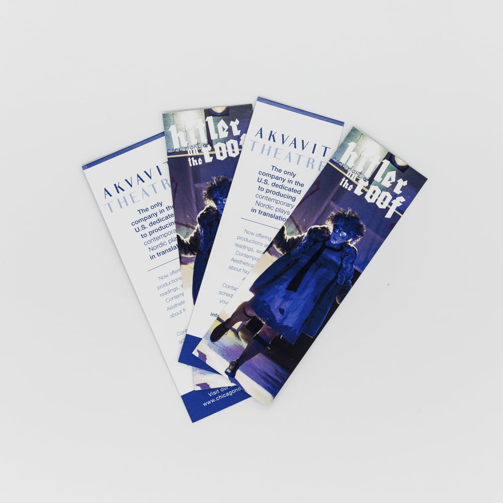
Folded travel brochures – formats & best practices
Folded travel brochures are timeless – they are tactile, organized, and ideal for storytelling. In travel marketing, we most commonly use tri-fold, bi-fold, Z-fold, and gatefold depending on how much information we need to share.
Common folded formats
| Format | Best Use Case | Why It Works |
|---|---|---|
| Tri-fold | General travel packages, day tours | Six panels = structured storytelling |
| Bi-fold | Luxury packages | Space for large imagery; premium feel |
| Z-fold | Itinerary reveals | Sequential storytelling |
| Gatefold | High-end destination launches | Dramatic reveal effect |
Tri-fold blueprint (our proven layout):
- Front panel: Captivating headline + hero image
- Inside: Benefits + highlights + 3–5 key images
- Back panel: CTA + contact info + QR code
Bi-fold blueprint (for luxury itineraries):
- Cover: Minimalist image + elegant headline
- Inside: Itinerary storytelling with white space
- Back: Premium CTA (“Reserve Your Suite”)
Design best practices:
- Never crowd every panel.
- Use panels to guide a narrative – curiosity, discovery, action.
- Keep one CTA visible on the back panel (phone + QR code).
Paper & finish recommendations:
Use 300–350gsm matte stock for premium touch. Glossy finish works for beach or adventure visuals because it feels dynamic and bright.
Pro Tip:
Use maps and icons instead of text-heavy explanations. Let visuals do the work.
When designed properly, folded brochures don’t just deliver information –
they stage an experience.
Travel brochure dimensions and sizes
Standard brochure dimensions must consider readability, printing efficiency, portability, and template flexibility. Here are the most reliable dimensions for travel brochures:
| Brochure Type | Dimensions (inches) | Dimensions (mm) |
|---|---|---|
| Tri-fold (Letter) | 8.5 × 11 | 216 × 279 |
| Tri-fold (A4) | 8.3 × 11.7 | 210 × 297 |
| Bi-fold | 11 × 17 | 279 × 432 |
| Booklet style | 5.5 × 8.5 | 140 × 216 |
| Oversize display | 11 × 25.5 | 279 × 648 |
Bleed & safe margins:
- Bleed: 0.125–0.25 inches
- Safe margins: 0.25 inches inside
Without proper bleed, trimming cuts text – especially on tri-fold panels.
We always provide a master template with guidelines.
Why dimensions matter
Larger brochures communicate premium value. Smaller brochures perform best for mass distribution at airports, hotel desks, and visitor centers.
Best sizing strategy for travel marketing:
- Luxury: Bi-fold or oversize
- Budget/Volume campaigns: Tri-fold letter size
- Events & trade shows: Compact size with QR code
We prefer templates designed with multiple size variants for efficiency.
Custom travel brochure design services
Not all travel agencies have design teams – that’s where custom travel brochure design services deliver value. We develop brochures tailored to business type, demographic targeting, destination focus, and campaign objective.
What custom service includes:
- Research (destination, audience, package positioning)
- Full creative concept
- Template selection or creation
- Typography + color system
- Image sourcing + editing
- Copywriting + captions + CTAs
- Print-ready + digital-ready versions
Why agencies prefer custom services:
- Templates save time, but custom design sells the emotion.
- Custom layouts allow premium storytelling.
- Branding is consistent across campaigns.
Deliverables we provide:
- Master InDesign/Canva files
- Digital interactive version (PDF flipbook or microsite)
- Social media promotional assets
Professionally designed brochures close sales faster because design reinforces trust and value.
Travel brochure marketing strategies
A travel brochure is not just a design asset – it’s a sales funnel tool.
We majorly use these marketing strategies:
- Lead Capture Strategy
- QR code → landing page with booking form.
- Interest Nurture Strategy
- Send digital brochures via automated email.
- Conversion Follow-up Strategy
- Retarget brochure viewers with ads.
- Cross-promotion Strategy
- Display brochures at hotels, restaurants, visitor centers.
CTA examples that convert:
- “Reserve Before Seats Fill”
- “Download Itinerary & Pricing”
- “Talk to Destination Expert”
Great brochures make the traveler imagine themselves already there.
Order Now
Distribution methods: events, trade shows & local partners
Brochures don’t work unless they reach the right hands.
Best distribution channels
- Travel expos & trade shows
- Tourist information centers
- Hotel lobbies
- Airline lounges
- Partner restaurants
- Tourism offices
Event strategy
- Use a stand with brochures arranged vertically (not flat).
- Pair brochures with QR scanners for digital link capture.
Local partner collaboration
Place brochures where travelers already spend money:
- cafés near attractions
- boutique hotels
- co-working spaces for digital nomads
QR codes, interactive elements & tracking
Printed brochures become measurable when QR codes are added.
Where to place QR codes
- Front cover (to generate curiosity)
- Pricing section
- Back panel (final CTA)
Tracking elements to monitor:
- Click-through rate
- Lead form completions
- Destination search interest
Travel brochure case studies & success stories
Case studies are proof that brochures drive real business.
Example:
After redesigning a luxury Maldives travel brochure with a minimalist template + QR code + interactive digital itinerary, conversions increased 31% within six weeks.
Eco-friendly travel brochures & sustainable printing
Travelers care about sustainability – brochures must reflect that.
Use:
- recycled paper
- soy-based inks
- FSC-certified printers
- minimal ink usage templates
Promote sustainability:
“Printed responsibly using recycled materials.”
Targeting: demographics & niche audiences
The same brochure cannot speak to everyone.
Audience segmentation framework
- Age (millennials, seniors, families)
- Travel style (luxury, adventure, budget)
- Intent (honeymoon, solo, corporate retreat)
Psychographics
- Motivations
- Desired experiences
- Decision triggers
Each audience needs unique messaging, visuals, and layouts.
Your Business Card as a Sales Tool
A business card is not only contact info – it’s a mini sales pitch.
Add value-driven elements:
- A short tagline (e.g., “Premium Car Detailing | Mobile Service”)
- A QR code to your website or booking form
- Social proof (reviews badge or “Rated ★★★★★ on Google”)
Business Cards for Networking Events
When attending:
- Trade shows
- Expos
- Conferences
- Community business meetups
Carry at least 100–250 cards.
Networking is fast-paced – people remember visuals more than conversations.
Use bold colors + strong offer + QR code for fast action.
Business Card Etiquette (Professional Do’s & Don’ts)
| Do | Don’t |
|---|---|
| Hand card with intention | Give multiple cards randomly |
| Make eye contact | Force people to take your card |
| Use clean/new cards | Give wrinkled or damaged cards |
| Follow up via email/WhatsApp | Send long sales messages |
Why QR Codes on Business Cards Boost Conversions
QR codes have become the new standard for business cards.
Benefits:
- Instant website or WhatsApp message
- No typing numbers manually
- Higher engagement rate than traditional cards
Example idea:
QR code → WhatsApp auto-message: “Hello! I saw your business card.”
Designing Business Cards for Digital & Social Branding
Maximize both physical + digital identity:
- Include Instagram / Facebook / LinkedIn icons
- Use brand colors
- Match card design with your website theme
- Maintain consistent typography
Brand consistency = trust.
Paper Types and Thickness (What to Choose)
Best options:
| Paper Type | Finish | Best For |
|---|---|---|
| 16pt cardstock | Matte | Minimalist luxury |
| 16pt + Soft Touch Lamination | Velvet feel | Premium brands |
| 18pt / 32pt Uncoated | Pen-friendly | Real estate / consultants |
| PVC / Plastic Cards | Waterproof | Gyms, Membership cards |
If you want luxury:
➡ Soft touch + raised spot UV
Cost of Business Cards (Price Factors)
Price depends on:
- Quantity (100, 500, 1000)
- Paper thickness
- Finish type (matte / gloss / velvet)
- Single or double-sided
- Custom shapes (rounded corners, die cut, foil)
Tip:
Order 500 instead of 100 – cost per card drops by 40–60%.
Business Card Mistakes to Avoid
❌ Too much text
❌ Small fonts
❌ No call to action
❌ Using cheap thin paper
❌ Wrong color contrast (can’t read)
✅ Keep it clean, minimal, and conversion-focused.
Business Cards for Impressions (Psychology of Design)
First impression forms in 0.3 seconds.
People judge:
- Weight of the card
- Texture
- Color palette
Heavy cards feel more valuable = you look more professional.
Final Checklist Before Printing
Before sending to the printer, confirm:
- Bleed included (0.125”)
- Text safe margin maintained
- Color mode: CMYK (not RGB)
- 300 DPI resolution
- Proofread contact info – especially phone number
- QR code tested